Clue: Newsfeed +
Quiz of the day (QOTD)
Bridging the information gap between the app and website through interaction
Context
3-week academic project
proposing an additional feature after an
analysis of the app
Contributions
UI/UX design, Content strategy,
User research, Project management
Team
Maggie Chan
BACKGROUND
About Clue
Clue is a menstrual cycle tracking app that helps those with cycles to have comprehensive understanding of what is happening in their bodies. After a thorough analysis of the app, this project proposes an additional feature to extend their knowledge.
After examining the Clue app, the team noted its visual language and core features as the follow:
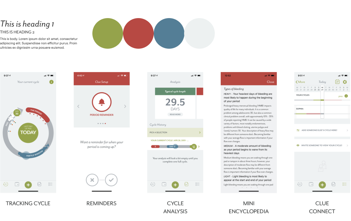
GETTING TO KNOW CLUE
Clue Encyclopedia
During the background research, the team discovered Clue's "Encyclopedia" page on their website.
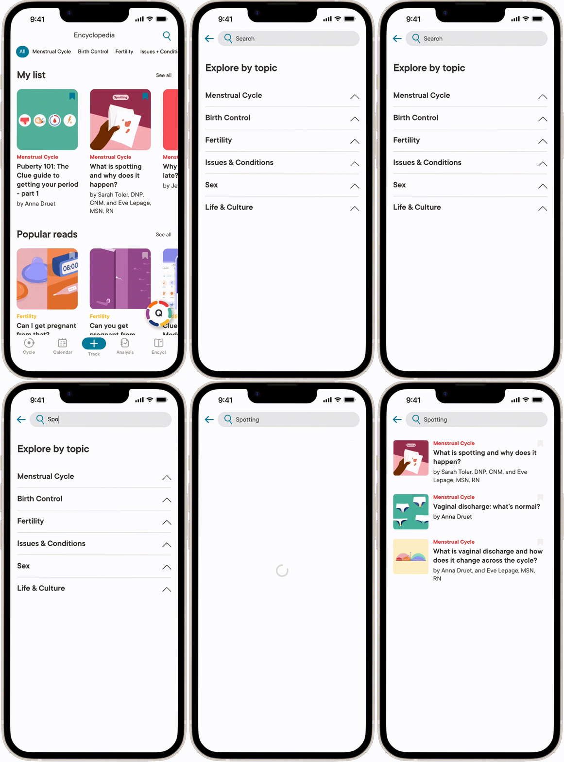
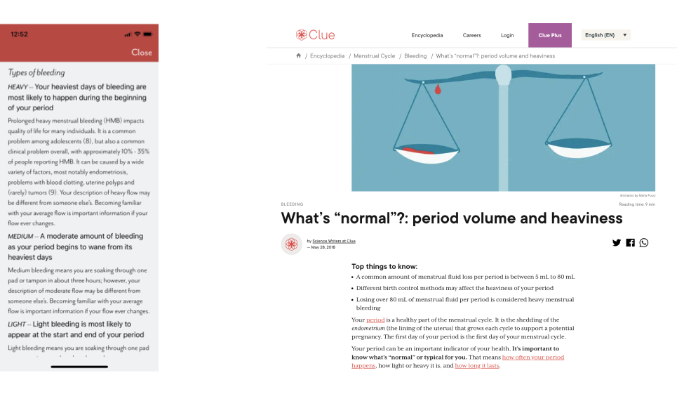
Clue Encyclopedia offers science-backed articles organized by various topics updated on regular basis. However the page is hidden under navigation and cannot be found on the app. Some of these contents are showcased on app behind the occasional ‘i’ icons, but not all information are stored and cannot be searched.
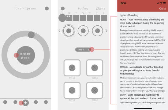
As well, the presentation of the same information differs between the two platforms. The Encyclopedia web articles are composed of text and images, which makes the information easier to digest. However, the "mini encyclopedia" pop-ups on app are text-only with narrow line heights. This can make it overwhelming to read, especially on a small screen.
Qualitative research
Qualitative research was conducted to identify areas for intervention.
The research was done in two parts: interviews and media analysis.
Interviews / 3 females | age 19-24
Goal
To find out beginner users’ interactions with the app
Interviewees were requested to download the app and navigate freely until they feel like they have looked into all the features. We asked the participants to have a think-out-loud walkthrough during this process.
Findings
- All interviewees found the app easy to navigate, and were able to input data smoothly.
- All interviewees noticed the internal encyclopedia on the app, tapping the "i" icon. However, they found the information overwhelming, and they did not read through the long scroll.
- When interviewees were asked why they clicked the icon; they replied that they wanted to know more.
Media analysis
Goal
To find out advanced users’ opinion of the app
Media analysis was conducted to gather the opinions of advanced users who are familiar with the app after using it for multiple cycles.
Popular online platforms were examined such as, YouTube videos showcasing Clue and other menstrual cycle apps, as well as their comment sections and ratings on app stores.
Findings
- Many people — especially new menstruators, turn to these domains seeking answers to questions they have about their bodies.
Clue's mission statement
Another important information the team found on web was Clue’s mission statement. We were very intrigued by the statement, we wanted to create a feature that would extend this promise.
Clue helps everyone who menstruates to understand their bodies—and to be empowered by that knowledge. Our vision is to enable women and people with cycles to live in tune with their biology, not in spite of it.
BUILDING BLOCKS
Framing the problem
Overall through the research, we had two insights. From these, we directed the project with a goal in mind to close this disparity.
- Clue users download the app with an interest and/or questions about their health and body.
- Clue produces various science-backed articles that answer menstruators’ curiosity; however they are not accessible on the app.
How might we bridge the information gap between the users and Clue's website content?
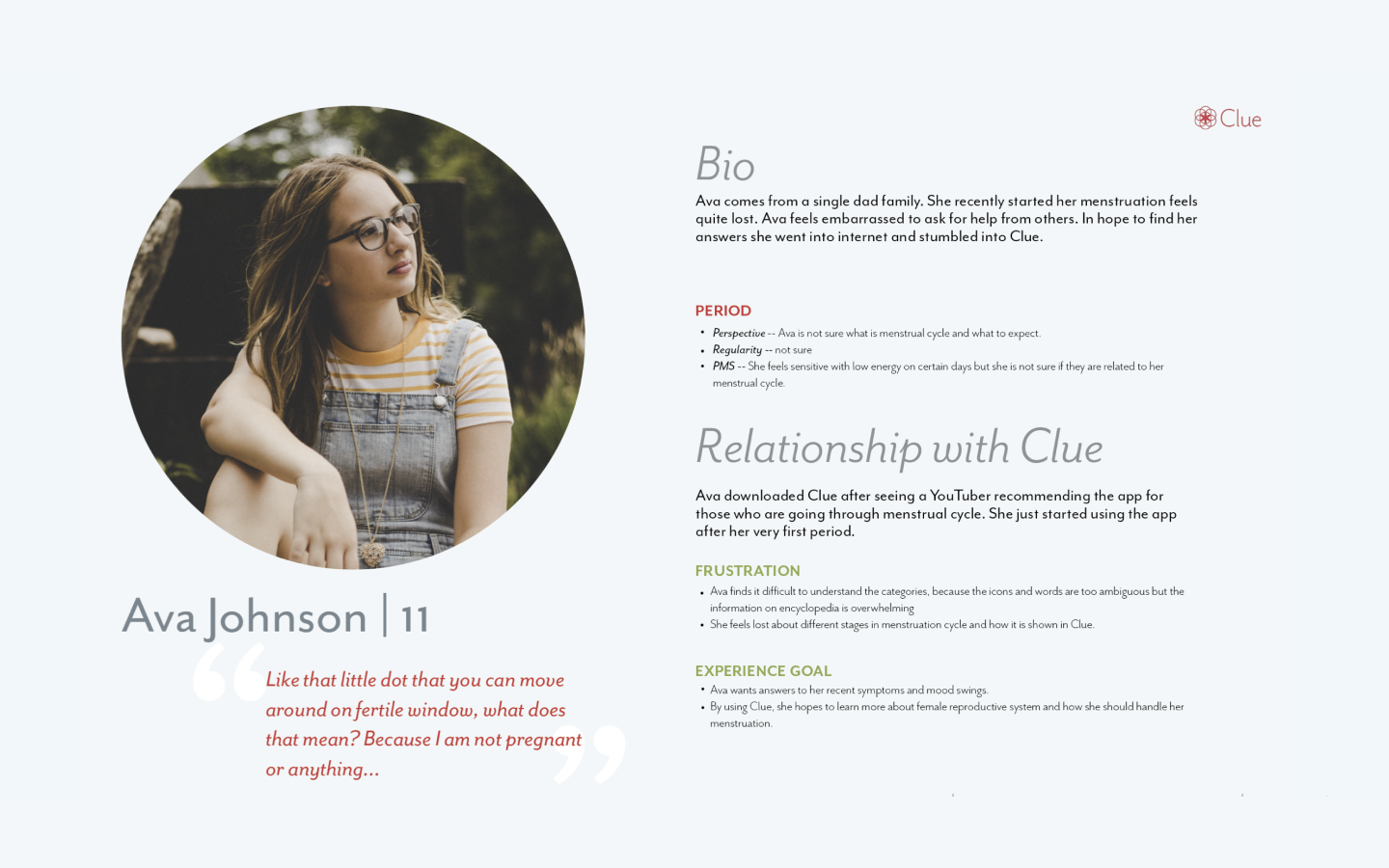
In bridging the information between website and app, we sought ways to increase the exposure of the available content to those seeking. We built the persona to organize our findings and narrow whom we are designing for. During this process, we decided to focus our demographic to new menstruators. After brainstorming and ideation sessions, we carefully crafted the proposal.
Persona
The project was scoped to focus on new menstruators. Focusing on new menstruators allows us to view menstruation from a different perspective; one that is often oblivious, uninformed, and helpless. By recognizing these limitations and restraints, we were able to guide the project better to design more empathetic solution.
THE PROPOSAL
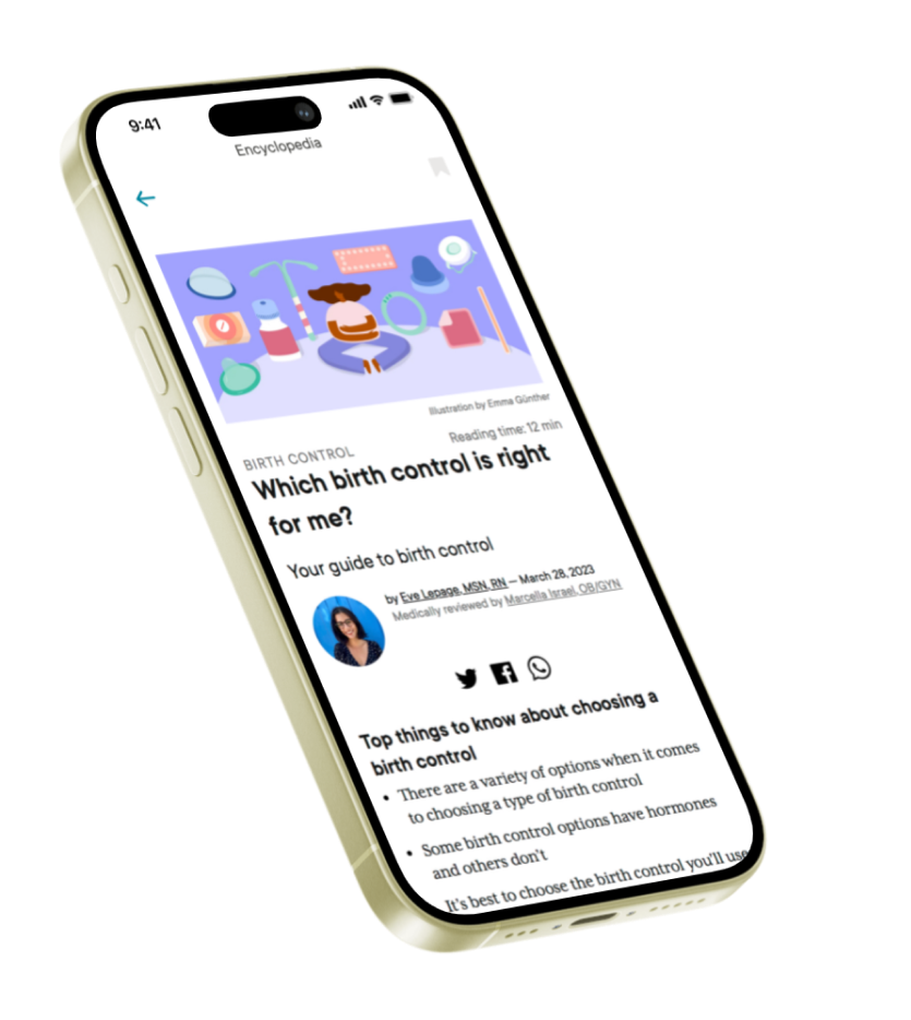
Newsfeed + Quiz of the Day (QOTD)
In bridging the information between website and app, we sought ways to increase the exposure of the available content, to those seeking, in an engaging manner. After brainstorming and ideation sessions, we carefully crafted the proposal.
Introducing Newsfeed + Quiz of the Day (QOTD)
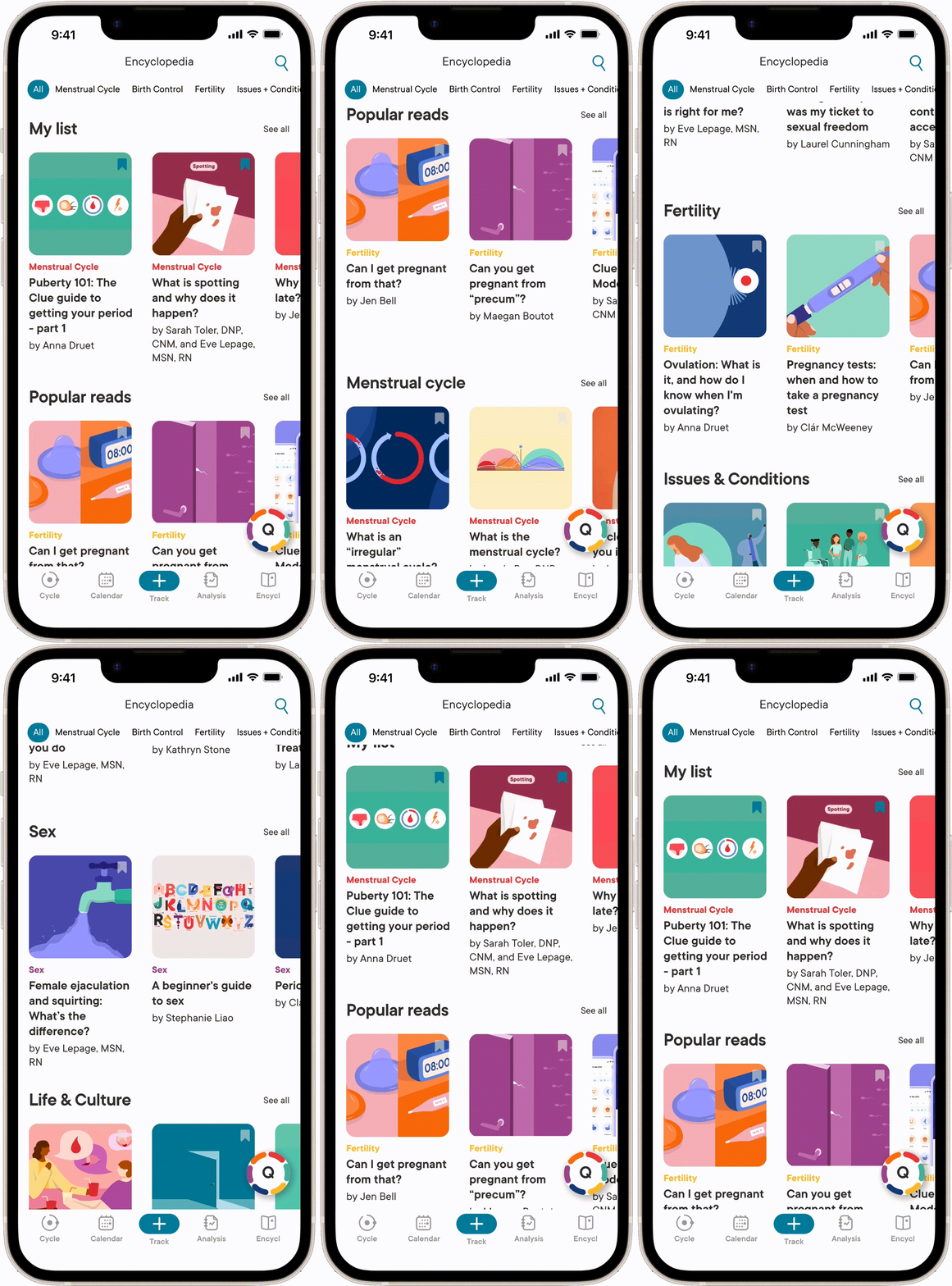
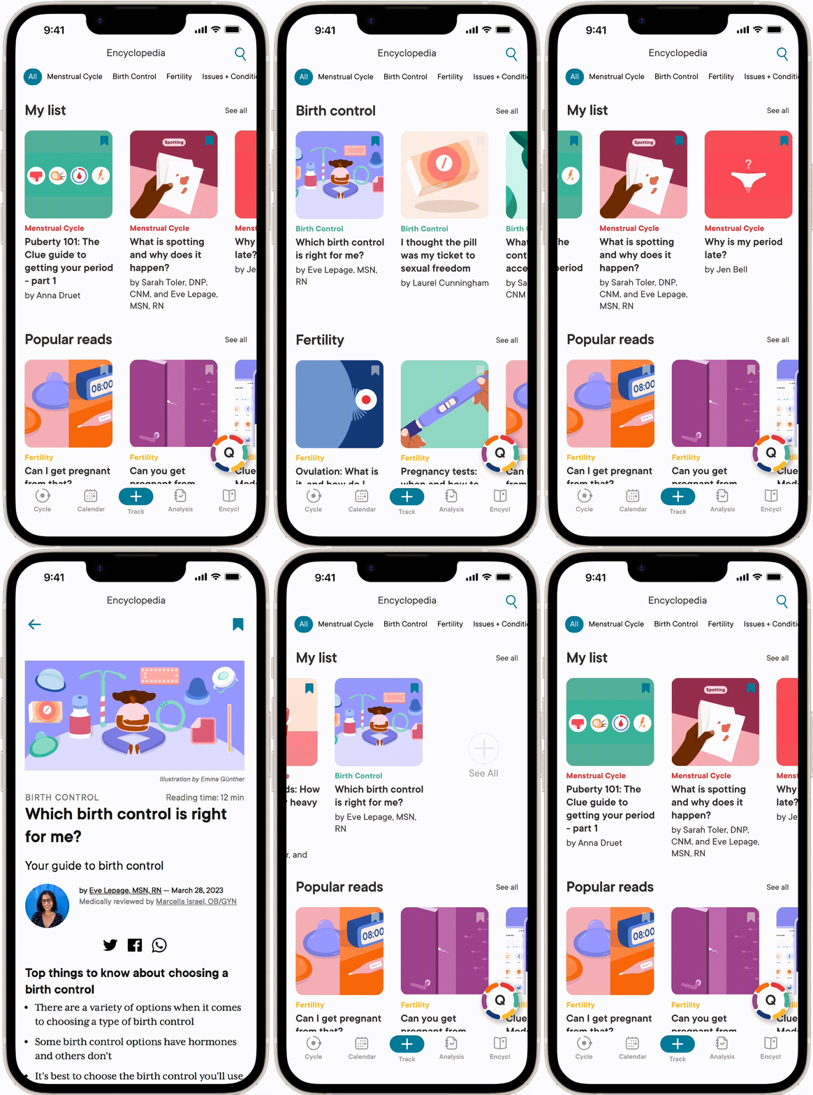
Newsfeed brings existing resources to the app to fill the information gap in the place where users connect with Clue the most.
Quiz of the day (QOTD) is a subsidiary feature that lets users to practice and challenge their knowledge through short, simple quizzes — serving both as a gateway and support to Newsfeed.
Newsfeed
Bridging the information gap
While information can be helpful, too much of it can be overwhelming. Newfeed lets users to choose from 6 main and 31 subcategories, so they can focus on the topics they care about without overloading their brains.
Users can save posts and find them later by filtering according to their preference, including options for new, old, least saved, and most saved posts.
Quiz of the Day
Empowerment through knowledge
Each QOTD quiz is composed of 3 true or false questions to keep it as simple as possible. The topics can be according to previously read articles for review; or random, for challenge.
QOTD aims to help individuals learn about their body in a quick, engaging way so they can be more informed and less blind to their own health.
Value proposition
To new menstruators and to Clue
Newsfeed and QOTD can bring value by offering quick and easy way to educate themselves about their bodies. In return, Clue can extend their mission statement by establishing itself as a reliable companion for users, whether they are new menstruators or at any stage in life.
Challenge and reflection
In the nature of being a menstruation app, it was difficult for our team to experience the full functionality of Clue in the given time. Moreover, we had difficulties finding intermediate users of Clue. Though we were able to find multiple intermediate users via YouTube and app stores to gather insight, it wasn't enough to holistically comprehend the intermediate users' pain points. Therefore, we focused on the proposal to bring value to beginner users.
If more time could be invested, the project could strengthen the quiz by enhancing "fun" (e.g. incorporation of game genre / motion plays) rather than simple, straightforward 3 questions. Also, the existing categorization by Clue could be simplified for easier navigation and consumption.
— thank you for taking your time to read through the project —
⸂⸂⸜(രᴗര๑)⸝⸃⸃
OTHER PROJECTS
easyJet / Type / Nederlands Dans Theatre / Hung Chong Tai Tea Co.
