easyJet
easyGo — a digital intervention to shift consumer's brand perception to more fun + explorational while helping exchange students to effortlessly plan their trips
Context
8-week academic project
digital design intervention proposal
Contributions
UI/UX design, Art direction, Content strategy, User research, Project management
Team
Alison Chan, Alfred Zhang,
Elly Wei, Maggie Chan
BACKGROUND
easyGo: designed for easyJet
easyJet is a European low-cost airline company that competes by providing accessible service to all. easyGo is a digital intervention for easyJet that helps shift the brand perception to be more fun and exploratory by assisting exchange students in planning their trips during their stay in Europe.
Business problem
During initial research on easyJet, the team noticed that the company's revenue growth rate has not been as high as its competitors', such as Ryanair and Wizz Air, in recent years.
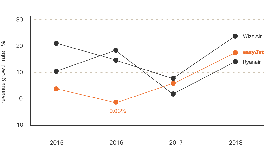
This finding highlights a potential area of concern for easyJet, as it suggests that the company may be losing market share to its rivals. It may also indicate that easyJet is not effectively differentiating itself from its competitors in the low-budget airline industry. As a result, our team saw an opportunity to propose a design intervention that could help easyJet stand out in the market.
easyJet and budget airlines in Europe
To find the area of design intervention, the team first wanted to better understand easyJet's brand values, where it stands in the low-budget airline industry, and the culture of the market.
From the market research, the team learned two things:
- easyJet provides more destination options and lower-cost services than its competitors.
- Low-cost airline flyers are usually aware of the low-quality setting on a plane and do not mind in exchange for a cheap deal.
The team noticed that easyJet successfully delivers the company mission of "making travel easy and affordable for all", fulfilling the tangible value.
However, the company lacked an aspirational brand value compared to its competitors. Each competing airline had a distinct character that set it apart from the others.

- Slightly lower priced than easyJet
- Offers the most number of destinations among budget airlines
- Promotes to have the lowest price in the market
- However uses secondary and regional airports to cut costs; sometimes doesn't travel to the indicated city, but to a nearby rural airport

- Similarly priced as easyJet
- Offers uncommon, unique destinations compared to other budget airlines
- Focuses on the explorative value in travel to differentiate
- Has a vibrant and young brand image

- Higher priced than competing budget airlines
- Offers relatively fewer destinations
- Promotes package deals
- Known to have better in-flight amenities
MARKET RESEARCH
Consumer perception vs. the desired image
To validate our initial review of easyJet's brand image, we conducted the first research on the brand perception of easyJet. We aimed to understand how consumers perceive easyJet and how easyJet wants to be perceived.
To gather consumers' perceptions, the team asked previous easyJet flyers about their experience and impression of the brand. Of the 59 participants, the majority responded with neutral or negative descriptions. The common adjectives used were:
- Cheap
- No frill
- Basic
In contrast, looking into the company’s desired brand perception, the two pillars of easyGroup’s 8 Branch Values caught our attention:
- Making a difference in people's lives
- Honest, open, caring + fun
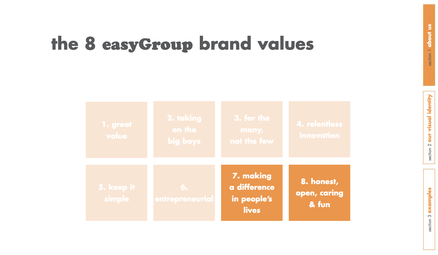
Based on this finding, we focused our design intervention on bridging the gap between consumers' brand perception and the company's desired image. Our goal was to create a product that adds aspirational value in line with the company's two pillars, and differentiates easyJet from other low-cost airlines in the market.
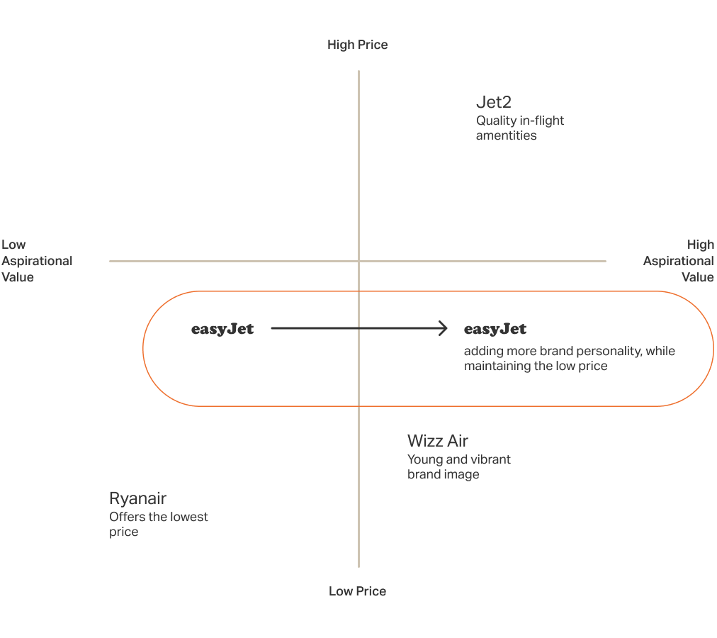
Understanding the user
After narrowing down the problem, we asked ourselves: who would be interested in the idea of low-cost travel in Europe? To further refine our project, the team established the following constraints: non-European, leisure traveler, and on a budget.
Non-European
- Visits the continent to experience new cultures
Leisure travel
- Actively seeks ways to enhance the travel experience
On-budget
- Chooses transportation based on value and cost-efficiency over comfort
As we delved deeper into the characteristics of potential customers, we noticed that exchange students share these travel constraints. Europe is the most popular region for students participating in an exchange program.
Every semester, students from around the world come to Europe, ready to experience its rich culture. We saw this as an opportunity for easyJet to tap into this niche market.
PERSONA
Designing for exchange students
In order to gain a better understanding of our target audience, we collected real study abroad experiences in Europe from non-Europeans. We aimed to learn about their travel habits, goals, and needs.
To avoid skewed results from a particular school or region, we sourced the survey from 26 different subreddits and Facebook groups related to travel, study abroad, and post-secondary institutions.
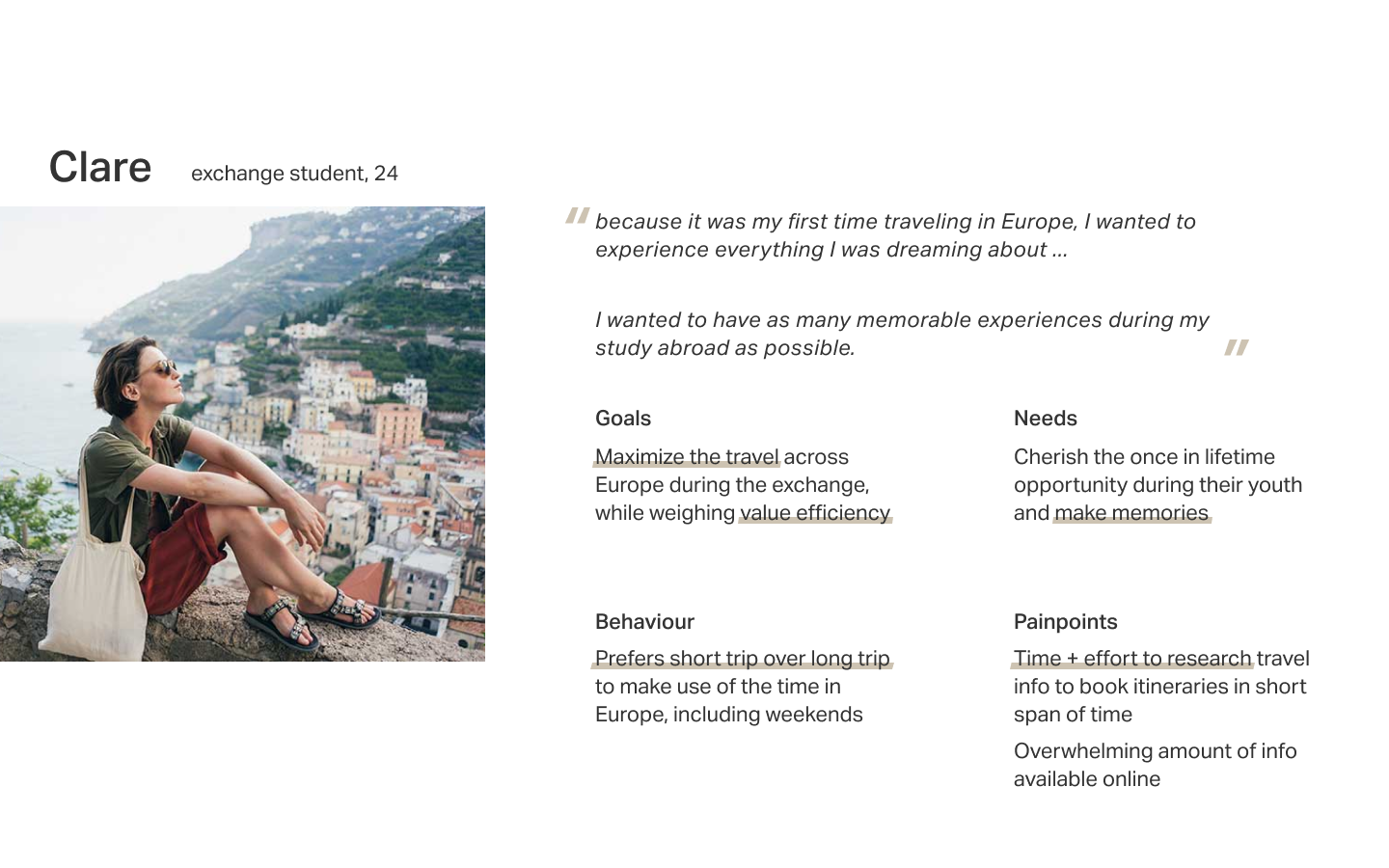
The survey had 113 participants, and we followed up with 5 interviews from the pool. We carefully synthesized the information from the survey and interviews to create the following persona.
Insights
The research and persona on exchange students revealed two valuable insights::
- Short trips are preferred over long trips. Exchange students tend to prefer trips that are 2-6 days long, as opposed to longer trips that last a week or more. This allows them to take advantage of weekends and visit as many places as possible during their time in Europe.
- They have an open perception about their next travel destination. Exchange students tend to prioritize value efficiency and accessibility (such as lightning deals and school schedules) over their existing opinions when deciding where to travel next.
User journey
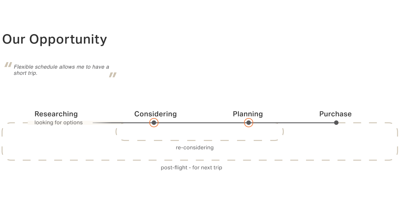
A journey map was created to improve our understanding of how students plan trips during their exchange program. Through this map, we discovered that students continuously plan their trips to Europe, starting soon after returning from their previous trip, in order to make the most of their time there.
During the planning stage, they search for an attractive travel destination and then look for appropriate means of transportation, such as buses, trains, and planes.
Students face frustration when they cannot find a suitable option that fits their schedule and budget. Then they have to restart their research on finding the next destination, opening and closing multiple tabs, and inputting the same information on different websites.
This process can be time-consuming and may leave students feeling overwhelmed. Here, we saw an opportunity to lower cognitive overhead of exchange students by streamlining the planning stage, allowing them to focus more on enjoying their time in Europe.
Framing
Connecting the dots between the identified business problem, persona insights, and user journey, we framed the project with the following ‘how might we’ questions to ensure our values during the process stay intact.
- How might we help exchange students to find flights based on their schedule and budget?
- How might we appeal unfamiliar destinations when browsing for the next trip?
- How might we attract exchange students to continue using easyJet?
THE INTERVENTION
Introducing easyGo
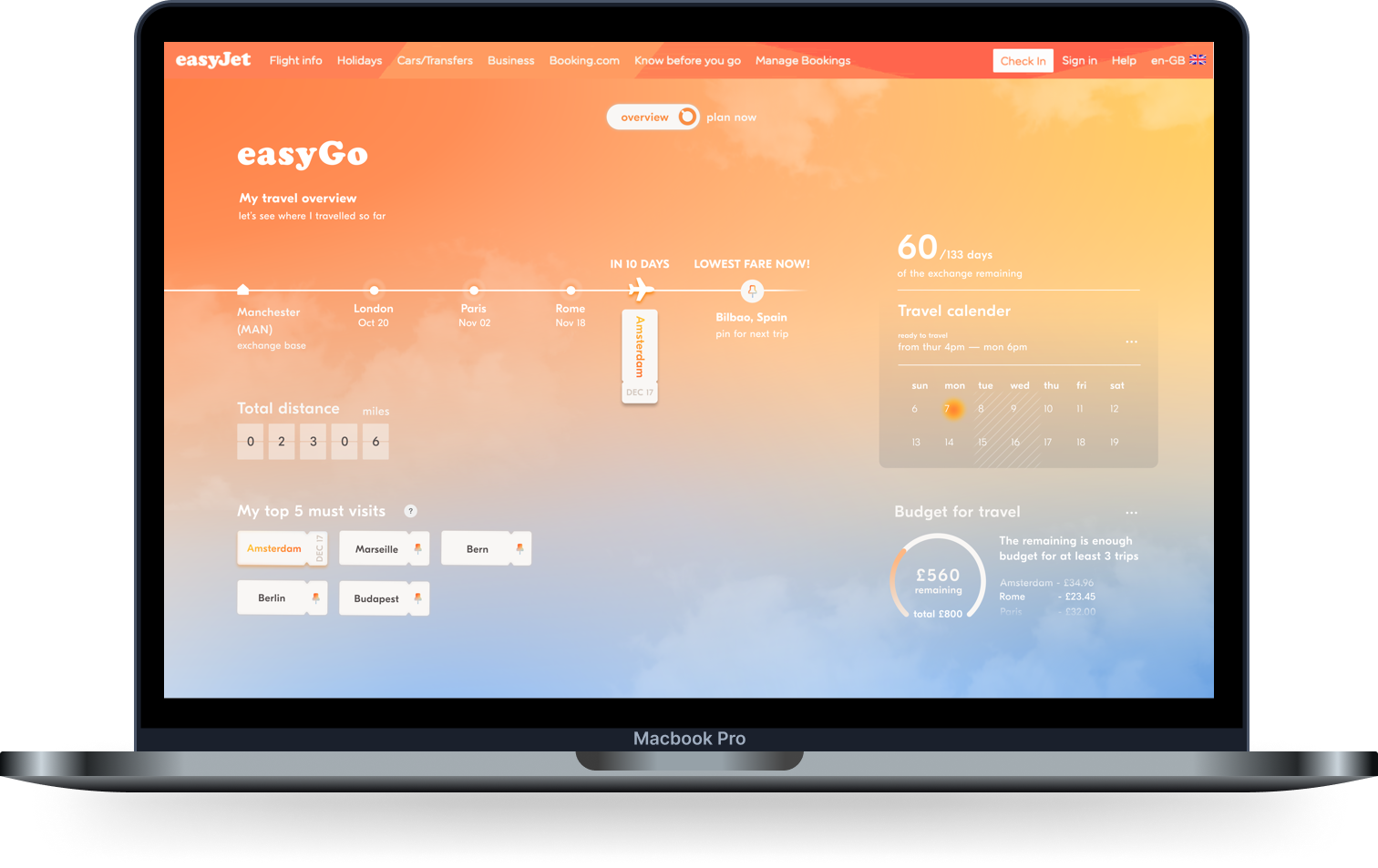
easyGo is a short trip planner that helps exchange students quickly book, plan future trips, and see their travel growth. Students can plan trips throughout their journey in Europe according to their unique time and budget; so travel can be fun and easy.
Overview
Travel at glance
The easyGo profile area captures the travel growth in different increments to celebrate the student’s journey over time with easyJet.
Plan now
Tailored for quick + easy planning
The tailored feed removes the unnecessary hassle of inputting the same information by always organizing the flights according to the student’s schedule and budget. Students can also filter the feed and pin interested destinations to their likings anytime.
Content design
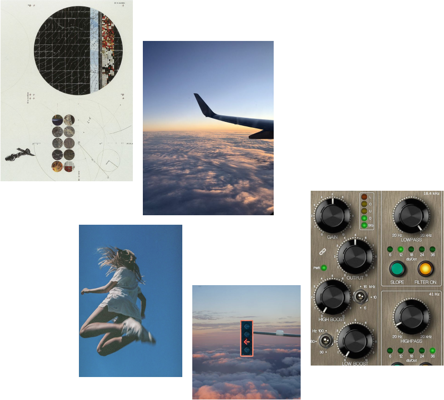
Composing the visual language, the team took into account easyJet's existing visual identity and exchange students' motivation to travel in order to come up with key concepts.
The easyJet orange has been reimagined to the color of sunrise, which is a time of day when change is most apparent and signifies the start of something new, like youth.
We also drew inspiration from airplane control panels and GPS systems to express the themes of travel and navigation. The key concepts we settled on were evoking motivation to travel and exploring to celebrate youth, resulting in a youthful, explorative, and inviting design.
Visual language

Moodboard
Value proposition
Value to easyJet
easyGo introduces a new image to easyJet, showcasing the explorative and youthful side of low-budget travel. With the intervention, easyJet can stand out in the low-budget airline industry by positioning itself as a travel companion for young travellers who are looking for affordable and convenient ways to explore the world.
Value to exchange students
Exchange students can save time while making new memories during their journey in Europe. easyGo makes flying with easyJet more accessible and enjoyable by offering a personalized and engaging platform that is tailored to travellers’ specific needs and interests. Whether for an exchange student in Europe or someone looking to see the world on budget, easyGo is the perfect travel partner.
— thank you for taking your time to read through the project —
⸂⸂⸜(രᴗര๑)⸝⸃⸃
OTHER PROJECTS
Clue / Type / Nederladns Dans Theatre / Hung Chong Tai Tea Co.