Type
Identify the font in pursuit, get inspiration for the next design, and check font compatibility in one place — a holistic typography app
Context
5-week academic project
designing hypothetical app
Contributions
UI/UX design, Concept development,
Content strategy, User research
Team
Maggie Chan, Victor Ng,
Shafira Vidyamaharani
INTERVENTION
Design opportunity
How can we streamline the process of exploring and discovering typography?
Design inspirations can come anytime, anywhere during the day. While there are a lot of different platforms to seek out visual and typography inspirations, there is no one repository dedicated to exploring, identifying, and experimenting with digital typography.
Type was designed while focusing on three core goals:
- Identify typefaces from physical and digital sources such as posters and websites
- Expand knowledge about digital typography
- Discover new typography and font pairing recommendations
INITIAL RESEARCH
Research overview
A mixed methods research survey was conducted on reddit.com/r/design. The survey consisted of multiple-choice and short-answer questions, and aimed to gather data on prospective users' sources of inspiration and ideation. The goal was to identify their habits and workflows when collecting typography inspiration.
From the research we learned that younger respondents gravitate towards image-based online platforms, while senior respondents use more balanced mix of between online, offline, graphics, and text-based content.
Nevertheless, we also discovered that many users, regardless of age, appreciate a balance of both graphic and text-based content in their explorations.
Mixed method research / 115 respondents
Methodology
Survey composed with multiple choice and short-answer questions; participants collected via Reddit
Age
35/ 115 participants in age above 30
80/ 115 participants in age of 18-30
Source of inspiration + ideation
Online platforms: Instagram, Facebook groups, Behance, Dribbble, Pinterest etc.
Offline mediums: magazines, books, nature etc.
Goal
To understand the habits of prospective and their process in finding the right type
Level of interest
40% have been interested in typography for more than 3 years but less than 10 years
30% have been interested in typography for more than 10 years
Precedents
To deliver a seamless and comprehensive interaction experience to multifaceted users, Type studied the precedents of image-based mobile platforms such as Pinterest and Behance as well as text-based platforms such as Medium and other article-based websites.
However, we noticed that inspiration-focused platforms rarely combine graphics and text-based content, limiting the flexibility of the search. To address this gap, our team designed Type with a goal to allow more comprehensive and flexible exploring journey.
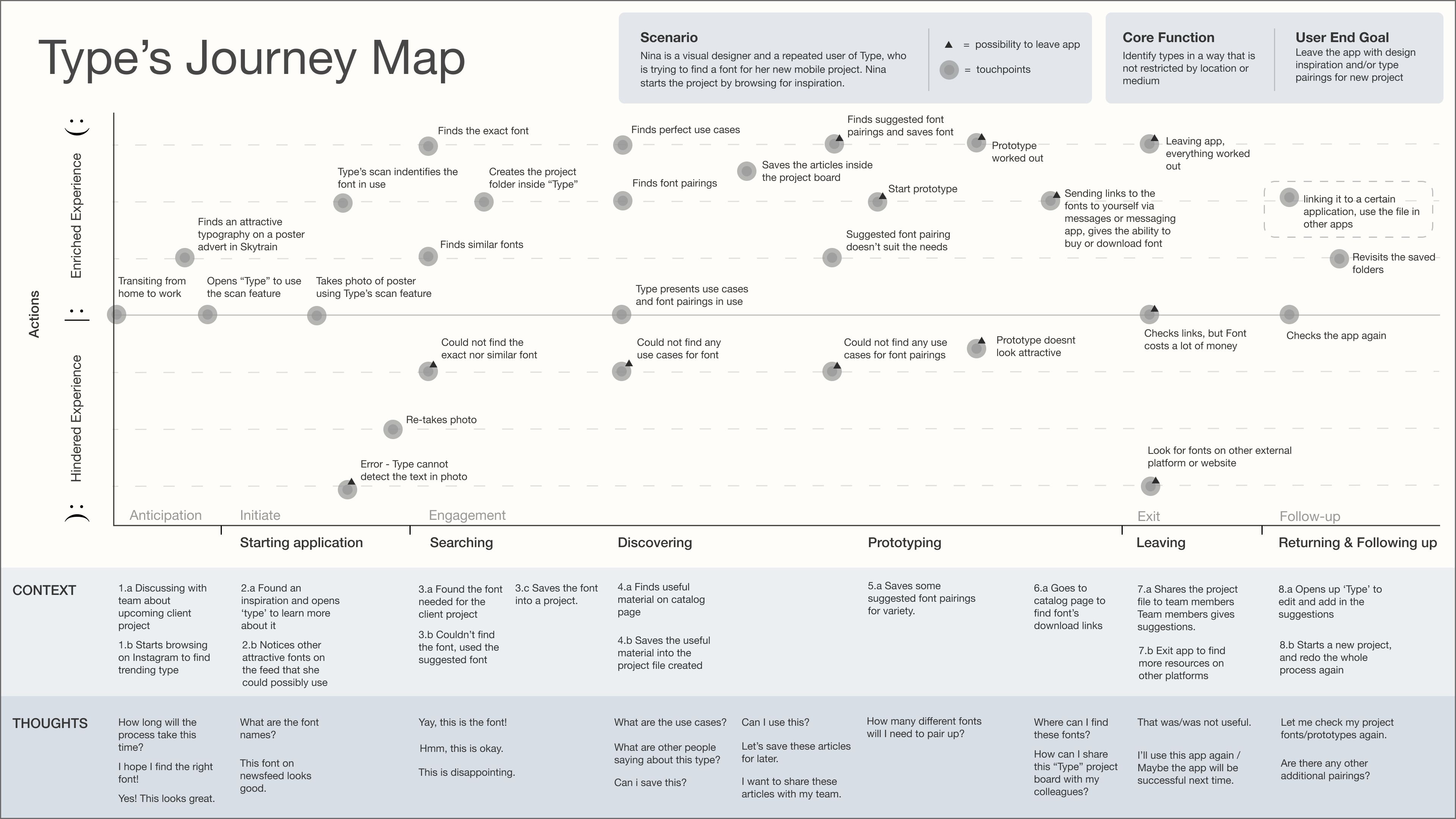
Journey Map
A journey map was used to understand the steps taken by font enthusiasts in gathering inspiration. This helped the team identify potential pain points and pleasure points.
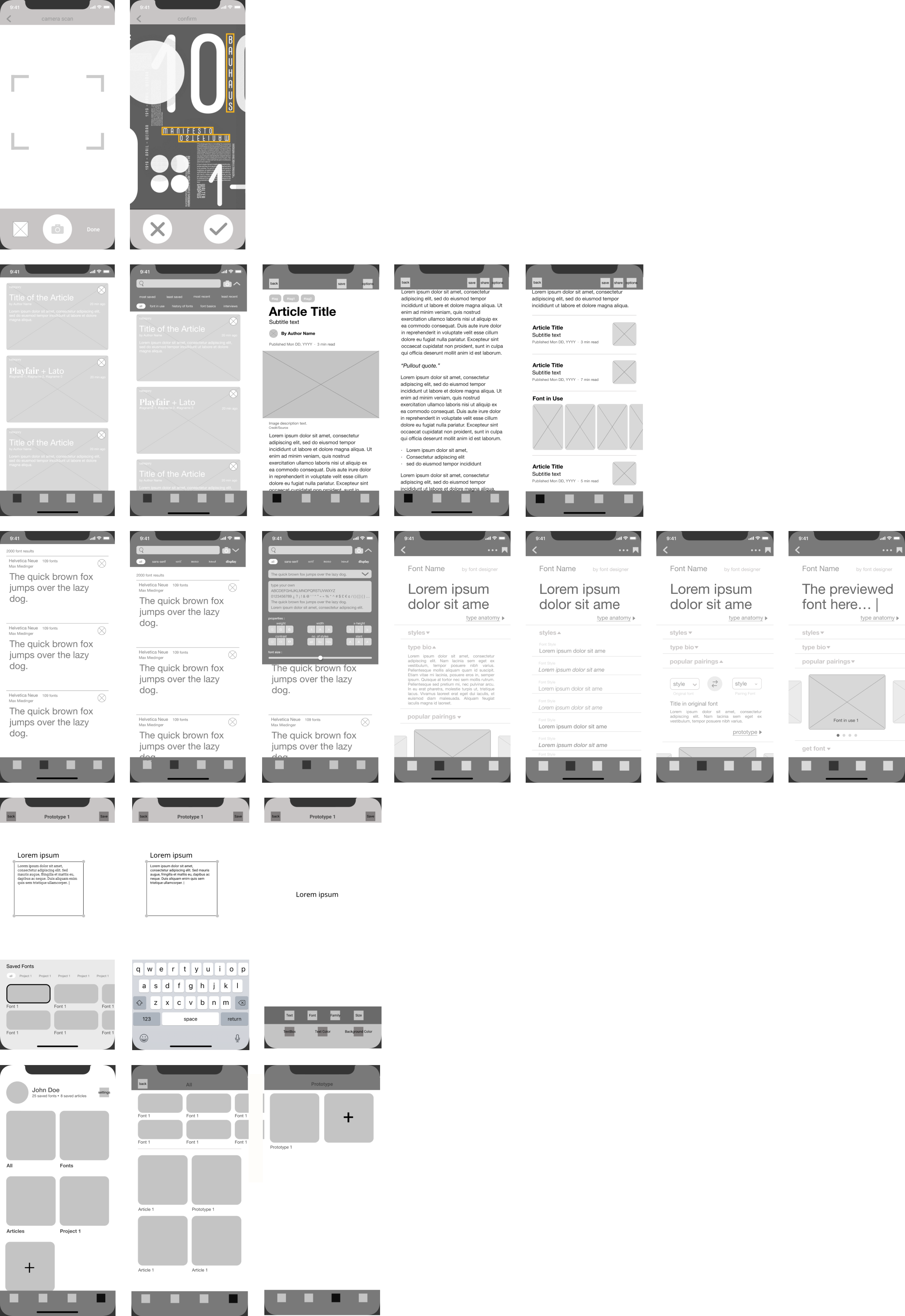
Wireframes
User test
User testing was conducted after creating mockups of all interactions. Overall, there were no major usability errors while participants navigated through the app to complete the given tasks. They liked how Type differentiates from existing resources by focusing on typography.
Participants found that seeing design trends, styles and font pairings is a helpful source of inspiration as, real-life typography inspirations come at any time of the day. Type's ease of use streamlines the steps of discovery and rapid prototyping.
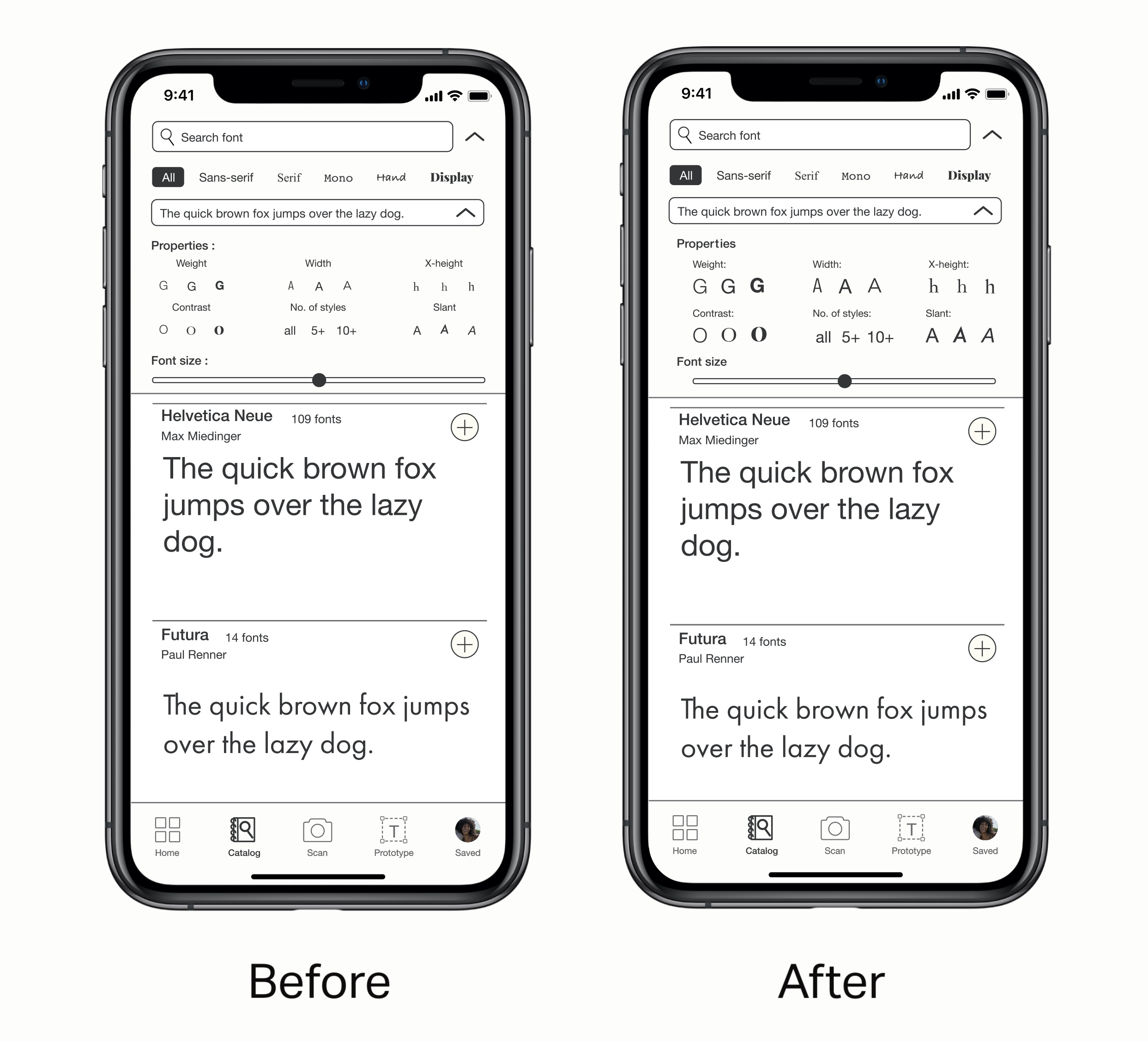
Minor changes were made in the interface and content after the user test, filter and inconsistent vocabulary were adjusted according to the test findings from the original mockups.
Visual identity

FINAL PRODUCT
Introducing Type
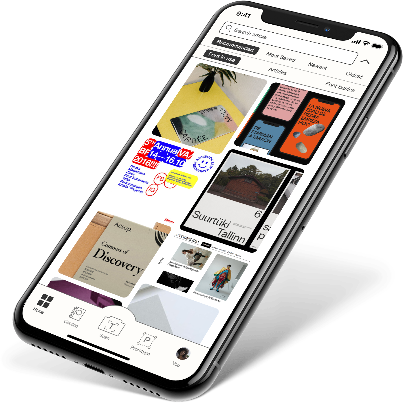
Type offers five core features: Home / Catalog / Scan / Prototype / You (personalization).
Home feed
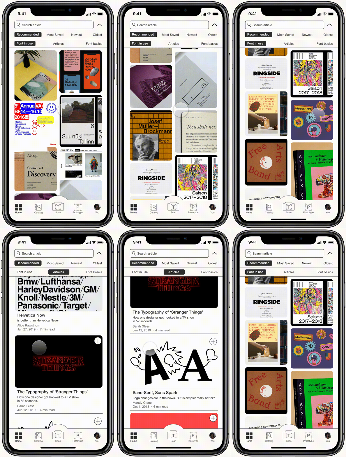
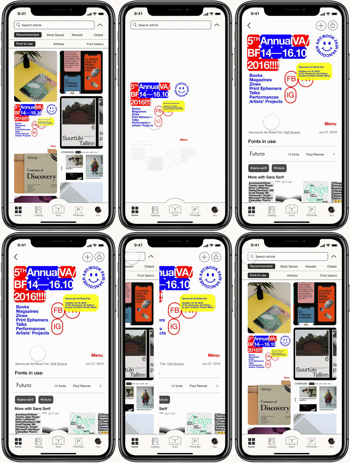
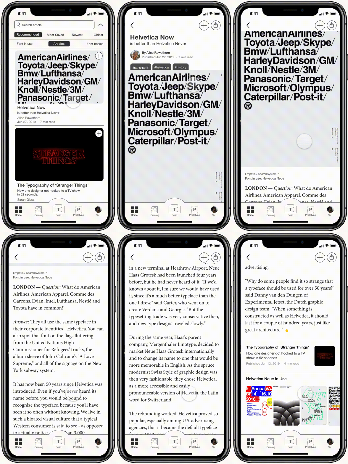
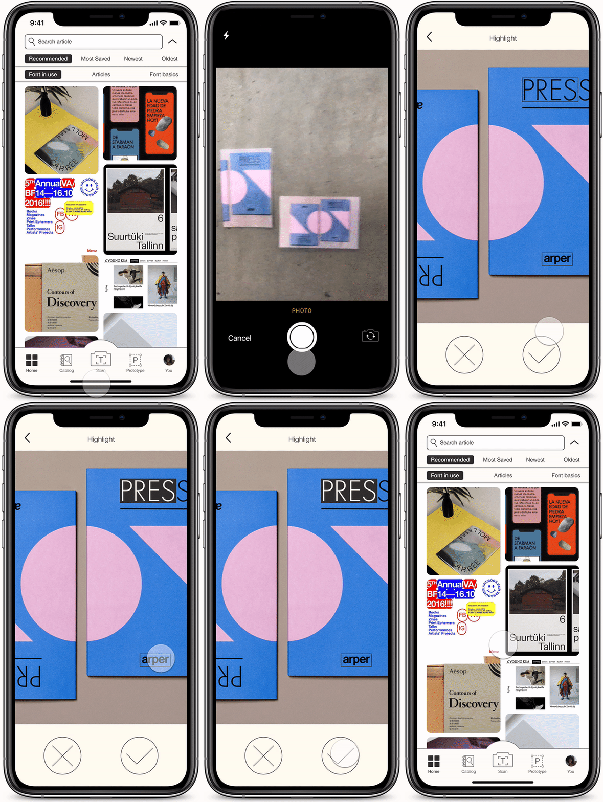
An area for information and inspiration; the landing feed page allows for browsing new articles about typography as well as how types live in applied design.
Catalog
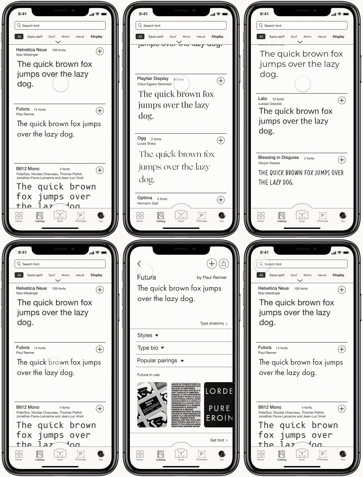
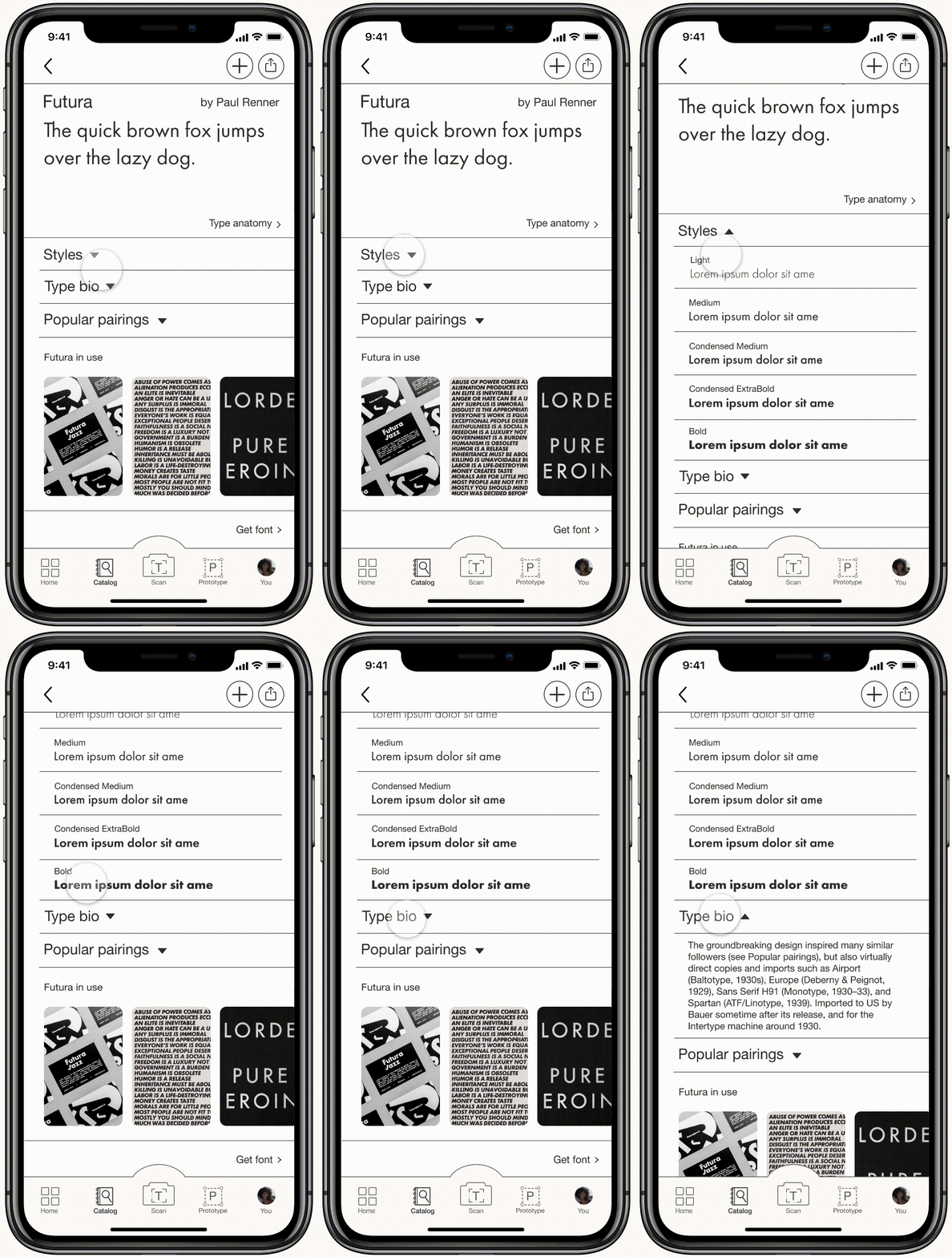
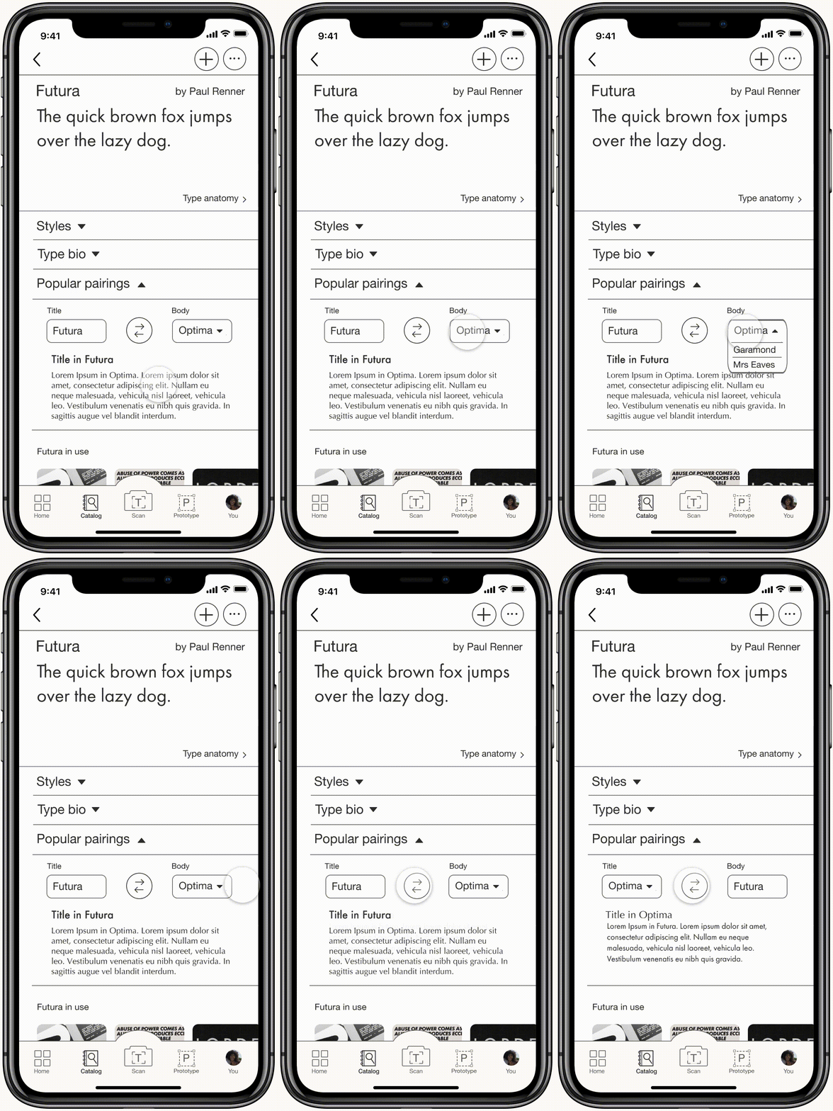
A secondary area for inspiration and education; works as a repository area of all fonts housed within Type for browsing font faces and allowing the users to find the right font for their next project.
Scan
Designed for users to find the exact font they are searching for. Unrestricted by location, users can simply take a photo or upload it from the album to scan the type they would like to identify.
Prototype
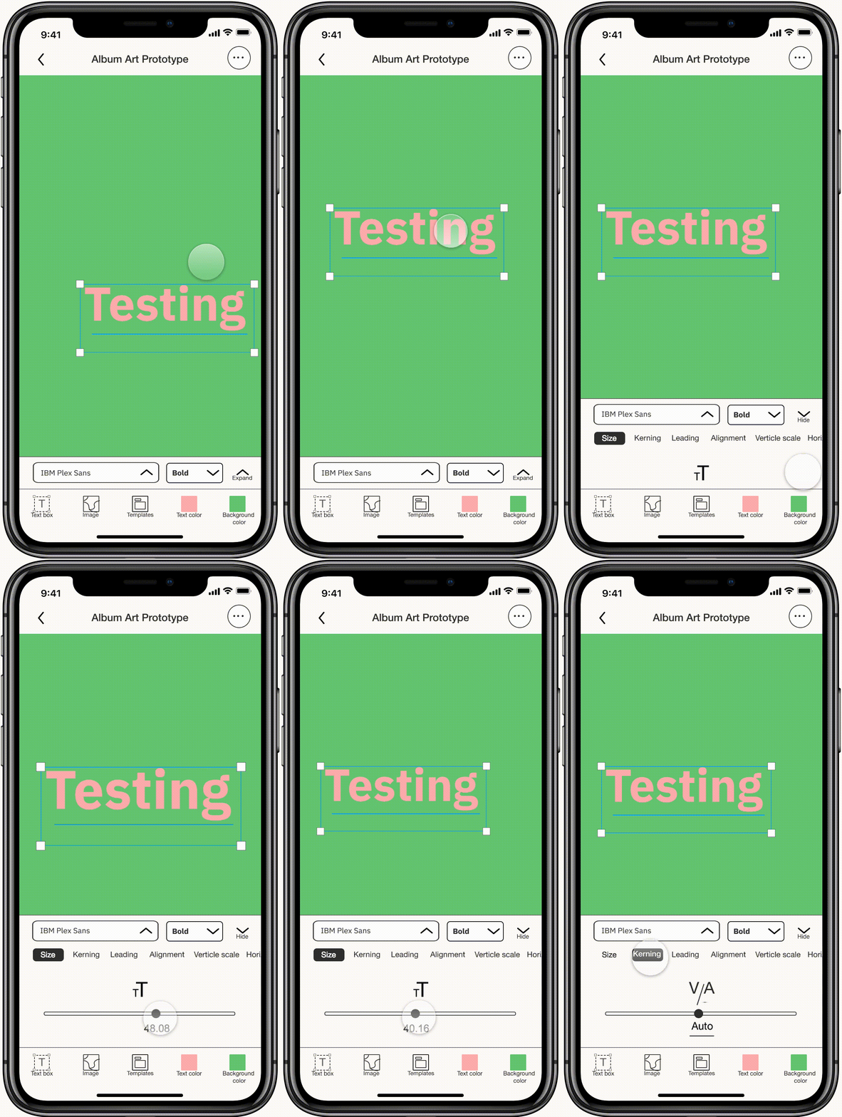
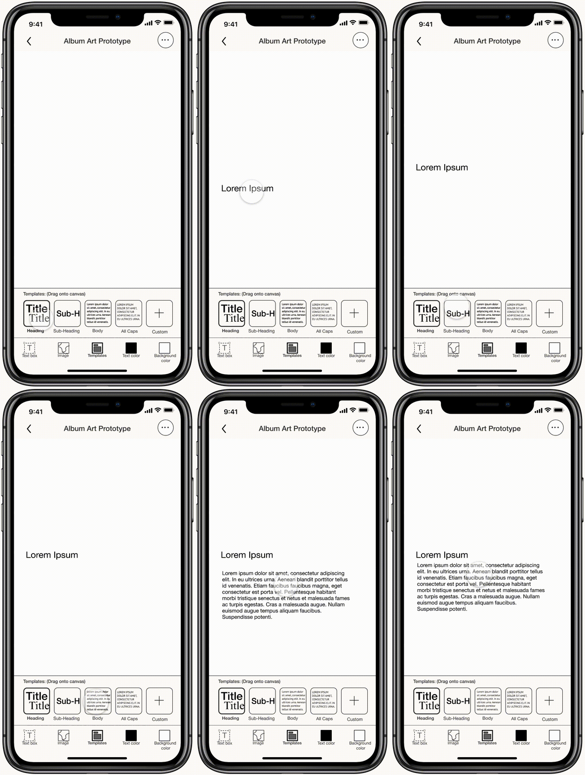
Area for testing fonts and font pairings with colors, including background. Saved fonts are based on saved content.
You
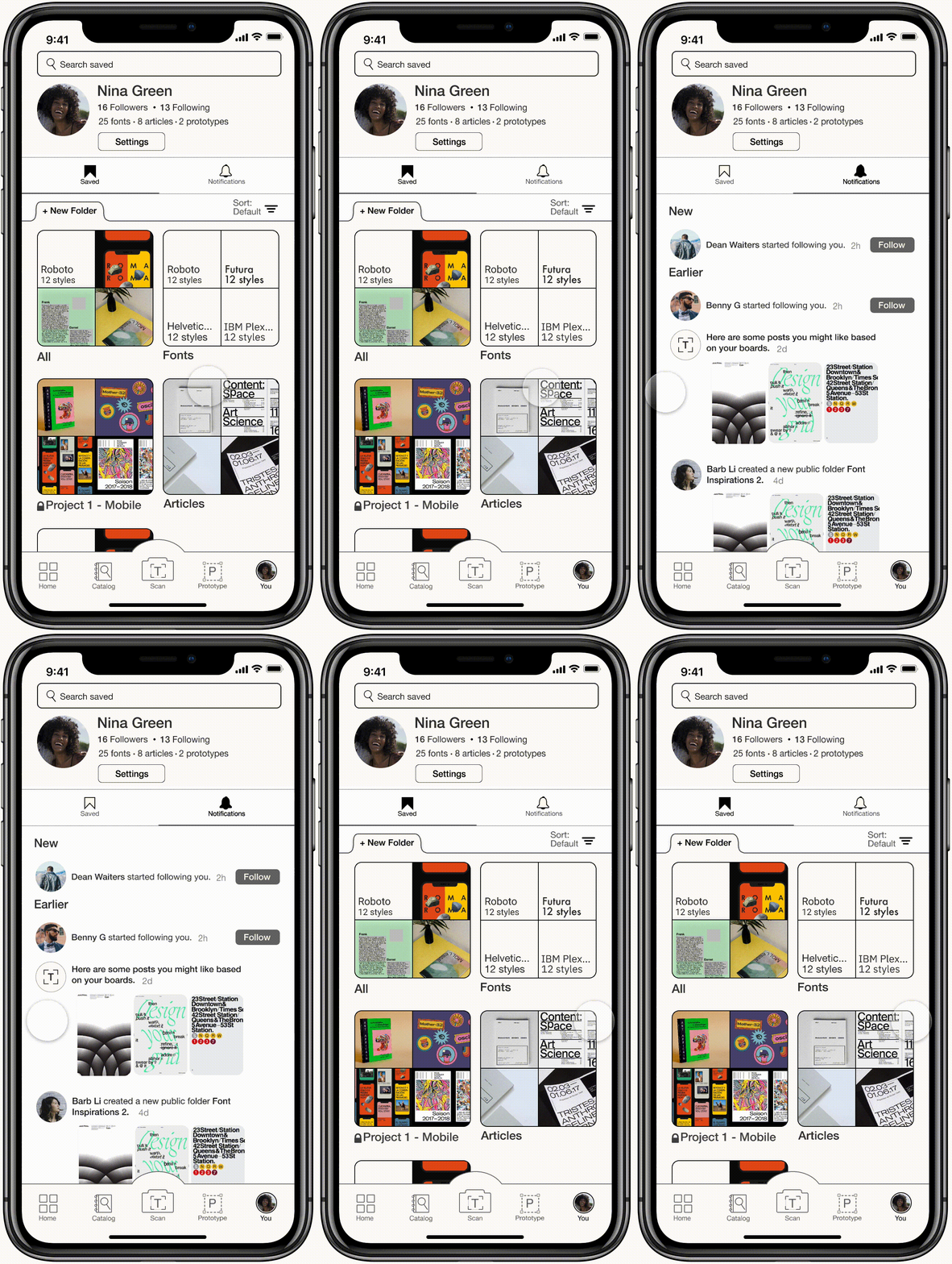
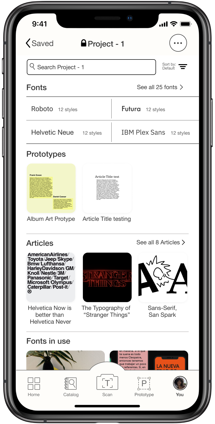
Area for customization; the user’s Profile and Saved feature allows them to create an inspiration board to save fonts, articles, and any posts of their interests in the app.
Challenge and reflection
The main obstacle in developing Type was narrowing down the scope of functionality while filtering the essential needs from the users’ interests. Type’s offerings were simplified by referring to the initial intention and core values while staying open-minded in the making. If more time was allowed, conducting user tests of more participants with a wider age range and cultural backgrounds could strengthen the usability of Type with a broader spectrum.
— Thank you for taking your time to read through the project —
⸂⸂⸜(രᴗര๑)⸝⸃⸃
OTHER PROJECTS
easyJet / Clue / Nederlands Dans Theatre / Hung Chong Tai Tea Co.
